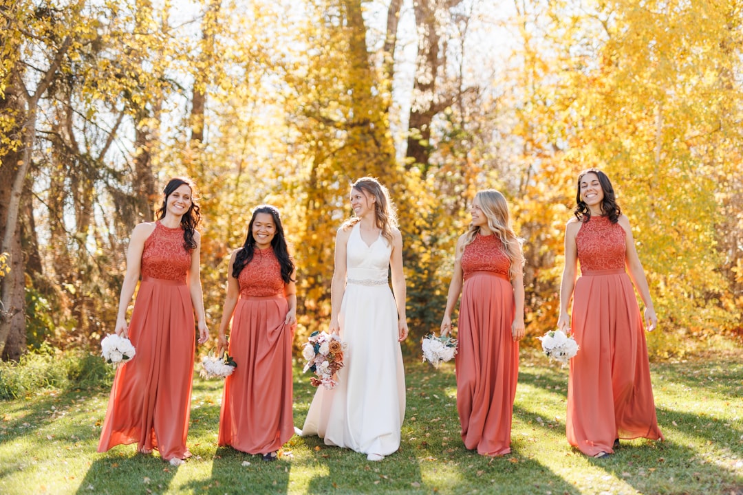
How to Build a 2025 Wedding Color Palette Around Burnt Sienna (and What to Drop)
How to Build a 2025 Wedding Color Palette Around Burnt Sienna (and What to Drop)
A planner in Portland started noticing it last November, before the official trend reports landed. A bride laid out fabric swatches on a conference table — rust, paprika, a deep terracotta — and asked if the florist could match the dried ochre of a nearby canyon. That request, once rare, is now arriving at studios and design houses several times a week. Burnt sienna, the red-brown earth tone that lives somewhere between brick and sunset, is the color story of 2025. And it is leaving blush behind.
The Fabric Swatch on the Conference Table
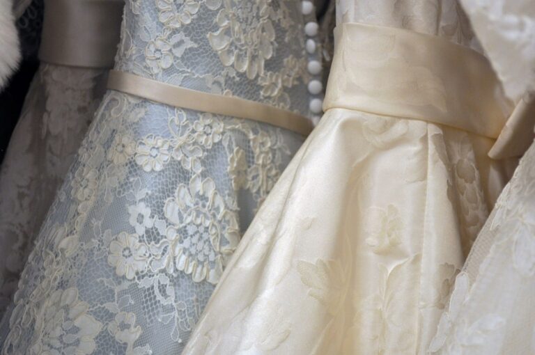
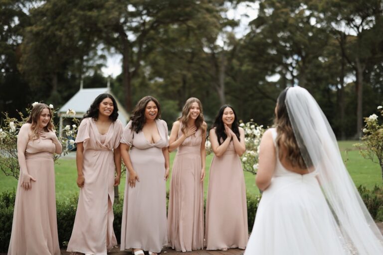
Blush has dominated American weddings for roughly a decade, evolving from a soft pink accent to a full-spectrum aesthetic that included rose gold charger plates, dusty pink linens, and bridesmaid dresses in five shades of petal. By 2023, it had become the default — so much so that many planners stopped suggesting it and waited for couples to ask for it. The problem with a default is that it eventually feels like a box.
Burnt sienna solves that. It is warmer, more dimensional, and far less forgiving of cheap materials. A pale pink tablecloth looks fine under fluorescent hotel ballroom lights. A burnt sienna one will show every crease and shadow, which means couples who choose it are also choosing better fabrics, better lighting, and better overall design. The color forces intentionality.
Seasoned wedding vendors tend to describe this shift as overdue. Blush, in their view, flattened a room — too much pink and everything read as one note. Burnt sienna creates contrast naturally. It sits opposite soft blues, teals, and sage greens on the wheel, which means complementary palettes emerge without a designer having to force them. It also works with metallics in a way blush never quite did: copper and bronze look obvious next to burnt sienna, while gold and rose gold read as different tones rather than variations on the same theme.
Desert, Coastal, Maximalist
The color is rarely used alone. Most 2025 palettes built around burnt sienna fall into three categories, each with a different emotional register.
The desert palette pairs burnt sienna with muted sage, warm cream, and a very dry olive green. This is the palette for outdoor ceremonies in arid landscapes — the California hills in late summer, the high desert of New Mexico, parts of southern France where the soil itself is reddish. It reads as grounded and slightly weathered, like something that has been in the sun for a long time and looks better for it.
The coastal palette swaps the greens for deep teal and navy, with accents of sand or oyster shell. This one works indoors or near water, because the blue pulls the warmth of the sienna into cooler territory without clashing. A reception space with cream walls and dark beams will hold this palette especially well — the sienna brings the heat, the blue keeps it from feeling oppressive.
The maximalist palette adds paprika, saffron yellow, and a deep maroon that is almost black. This is not a subtle choice. It works in rooms with high ceilings and lots of natural light, or in outdoor settings at golden hour, when the colors feel like an extension of the sunset rather than a competing force. Couples choosing this palette tend to know what they want and tend not to second-guess themselves.
Lavender, Lilac, and Silver
Blush is the obvious answer, but the full list of colors that fight with burnt sienna is longer than most couples expect. Cool pinks — the kind with blue undertones — look muddy next to burnt sienna. So do lavender, lilac, and any purple that leans toward magenta. The clash is not subtle; it reads as accidental, like two different weddings happening in the same room.
Soft gray is also worth reconsidering. Gray is a common neutral in wedding design, but paired with burnt sienna it tends to flatten the richness of the earth tone. Cream, ivory, or a very light wheat color works better — something with yellow or brown undertones rather than blue or green.
Silver metallics are another casualty. Silver next to burnt sienna looks cold in a way that is hard to fix with lighting or greenery. Copper, bronze, and matte gold are the better options, and they do not need to match each other exactly. A brushed copper vase next to a gold-rimmed charger reads as intentional layering rather than a mismatch.
Velvet, Linen, and the Paper Mockup
Fabric is the most forgiving place to start. Burnt sienna velvet reads as luxurious even at moderate quality, while linen in the same color has a more casual, relaxed feel that suits daytime or outdoor events. Rentals have caught up to the trend faster than most expect. A surprising number of rental companies in major metro areas now carry burnt sienna napkins, tablecloths, and chiavari chair cushions — but local inventory varies widely, and some companies still list the color as “terracotta” or “rust” in their catalogs.
Paper goods are trickier. Burnt sienna ink on white paper is unremarkable; the color needs a slightly off-white or cream stock to show its warmth. Couples who want the color on invitations should ask for a mockup before committing, because many commercial printers do not calibrate earth tones well and the result can look more brown than red.
Florals are where the color really comes alive. Dried arrangements work naturally — pampas grass, bunny tails, dried eucalyptus, and preserved ruscus all take on the warmth of burnt sienna accents. Fresh florists tend to reach for ranunculus, garden roses in deep coral shades, marigolds, and certain varieties of celosia. Greenery matters more than usual here: sage, eucalyptus, and olive branches cool down the composition, while darker greens like myrtle or Pittosporum make the sienna feel heavier.
The Ring Light at the Venue Walkthrough
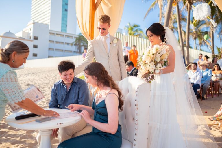
A color this saturated behaves differently under different light sources. In direct sunlight, burnt sienna reads as almost orange. Under warm incandescent lights, it deepens into something closer to chocolate. Under cool LED lights, it flattens and loses its richness entirely.
This is the single most common mistake couples make: they fall in love with the color in a fabric swatch held up to daylight, then see it under the reception venue’s lighting and wonder what went wrong. The fix is to visit the venue at the same time of day the reception will happen, with actual fabric swatches and paper samples, and observe how the color changes as the light shifts. If the venue has dimmable lights, test the color at the brightness level the couple intends to use, not at full power.
Some planners now carry a small ring light and a color-corrected bulb to venue walkthroughs specifically to demonstrate how their palette will look at night. It is the kind of detail that divides good planning from great planning.
When the Photographer Hasn’t Shot It Before
Burnt sienna is not a flash trend. It has been building for several years, appearing first in high-end editorial shoots, then in bridal fashion week runways, then gradually in real weddings. What changed in late 2024 was the pace. More couples began requesting it unprompted, and vendors started stocking for it rather than accommodating it as a special order.
The color is expected to peak in 2025 and hold through 2026, then gradually recede as it becomes the new default and couples begin looking for the thing that replaces it. That cycle is predictable and normal. The useful window for a couple who wants to feel current without chasing the next thing is right now — early enough that the color still reads as deliberate, late enough that vendors know how to execute it well.
One thing that surprises first-timers: burnt sienna photographs differently on different skin tones. On warm-toned skin, it reads as complementary and rich. On very fair or very cool-toned skin, it can wash out the subject if not balanced with other colors in the frame. A good photographer will know to adjust exposure and white balance to compensate, but couples should mention the color palette during the photographer interview and ask to see examples of similar tones in their portfolio. A photographer who has shot burnt sienna before will have an answer ready. One who hasn’t will usually say “we can adjust in post,” which is not the same thing.
Linen, Velvet, and Matte Ceramics
Dropping blush does not mean abandoning everything from the last decade of wedding design. The trend toward softer, more tactile materials — linen, velvet, matte ceramics — carries over perfectly. So does the preference for organic shapes over rigid symmetry. Burnt sienna actually works better with those design principles than blush did, because it does not need to be the star of every element. It can sit in the background as an accent or take center stage as the dominant color, and the palette adjusts accordingly.
What does not carry over is the pink-centric approach to flowers, bridesmaid dresses, and stationery. Those items will need to be chosen with the new palette in mind, and couples should expect to spend more time on them than they would have with blush, because the color is less forgiving. A wrong shade of burnt sienna can look like a mistake. The right shade looks intentional in a way that makes everything around it feel considered.
Whether any of this changes how a given wedding gets planned depends on how much the couple cares about color in the first place. For some, it is the organizing principle of the entire event. For others, it is a detail they will be happy to have gotten right without quite understanding why — a room that feels warm and finished, even if no one can name the exact shade of the napkins.
📷 Photos: Kyle McLeod (Unsplash), Anita Austvika (Unsplash)